By Jay Webb

Previously: A 2014 Resolution 4 Independent Artists — Separate Your Egos
 Walking down Main Street of the Sundance film festival this year, it felt like there was an ever-growing gap between the east and the west side of the street. Hollywood and Independent seem to be growing further and further apart, making the Sundance film festival, and other L.A. hyped festivals like it, such an increasingly awkward phenomena. You have a festival director who wants to keep the slate as Independent, fresh, and intriguing as possible, an audience that attends who has come to expect way more “accessible” stories, and big biz owned media companies like Variety claiming the festival “suffered from too much Brooklyn” and squawking at 2 million dollar advance tags for indie films in today’s market. We feel for you Mr. Redford, we do…but you created this monster, and now it ‘s become a near perfect representation of the dichotomy within the film Industry.
The divide:
This is not an East vs. West thing, but more of a continued divide in mentality and approach to film. It is exclusivity, public relations, and celebrity versus collaboration, community building, and storytelling. Old Hollywood versus new thinkers. Creatives vs. creative exploiters. I think there is some ancient adage about a poor old man with a paint brush who grew frightened he may never be able to buy paint again if something were to happen to his even older brother who convinces the village people that the old man’s art is worth money. If there is no adage, then now there is. The artist and the thinker are inherently self-critical and the Hollywood older brother is inherently opportunistic.


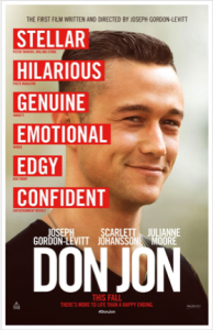
 It’s important that we understand the basics of what we call the movie poster. The standard movie poster has become a vertical 27” x 40” design originally made to fit inside a theater’s display. [This ignores lobby cards, window cards, the insert, the half-sheet, and the 3 and 6-sheets as well as the European and Asian anomalies.