Categories
Truly Free Film

The Case for Widescreen Key Art

by Bill Cunningham

Ted invited me to expand on a comment I made here on how the case can be made for rethinking the design standard for movie poster artwork in order to maximize the visual value to today’s audience, considering a film will likely be discovered online.  What I’m proposing is taking  the movie poster and turning it on its side, filling our view on the screen and our heads with storytelling potential. Not so much a radical rethink of key art design, but the next step in what has been an evolutionary process tied to distribution. People do judge a movie by its poster, and if independent filmmakers and distributors are to maximize their resources without maximizing costs, then the role and design of key art is definitely in order.

THE ROLE OF THE MOVIE POSTER

A picture is worth a thousand words, but a (good) movie poster ignites a thousand ideas – an expression of both art and commercial intent, selling the movie to the audience. It does this through craft, style, technique and marketing – ballyhoo made manifest.  This is why key art is important, especially to the indie, because if it makes a positive impression, it means the potential for financial as well as artistic success.  The better your key art, the lower the sales resistance.

THE TRADITIONAL MOVIE POSTER / KEY ART
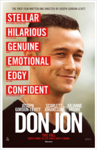
1It’s important that we understand the basics of what we call the movie poster.  The standard movie poster has become a vertical 27” x 40” design originally made to fit inside a theater’s display.  [This ignores  lobby cards, window cards, the insert, the half-sheet, and the 3 and 6-sheets as well as the European and Asian anomalies.

Categories
Truly Free Film

Rethinking Your Key Art Game Plan Part 2

By David Averbach

Note: This Key Art series is intended for micro-budget filmmakers whose crew is not under a union contract. If your film’s crew is under an IATSE contract, you will need to abide by the rules regarding still photographers on set as forth by the union. We have been advised that there may be penalties involved by bringing an intern or PA in to shoot stills.

Yesterday, in Part 1 of this blog series, I discussed how relying solely on 1920×1080 pixel frame grabs was a bad idea if one wanted to create a poster that featured some sort of main image. In an ideal world, your entire film would be shot on a 5K camera, and you could pull as many frames from the footage as you wanted. That would be Plan A. But in the real world, many filmmakers emerge from their shoots with only 1080p frame grabs, and that’s not going to work.

Another problem is about marketing. During the chaos of a film shoot, filmmakers often forget to think about the art they might need to support a variety of possible marketing ideas and concepts, and are therefore left with fewer choices and placed in an ultimately weaker position vis à vis possible options on how to market their film without an expensive and inconvenient reshoot.

Categories
Truly Free Film

Rethinking Your Key Art Game Plan Part 1

By David Averbach

Over the next several days, The Film Collaborative’s Creative Director, David Averbach, who has worked with dozens of TFC Clients and other filmmakers to help them create and refine their key art, will talk about ways you can avoid the problem of finding out all too late that you don’t actually have the proper materials to produce the key art you want to make.

Note: This Key Art series is intended for micro-budget filmmakers whose crew is not under a union contract. If your film’s crew is under an IATSE contract, you will need to abide by the rules regarding still photographers on set as forth by the union. We have been advised that there may be penalties involved by bringing an intern or PA in to shoot stills.

Takeaway: For narrative feature films, understanding the technical aspects of producing key art and thinking ahead to your key art while on your film set can save time, money and a heck of a lot of aggravation down the line.

If I had a nickel for every narrative feature filmmaker who has told me that they got a photographer, professional or otherwise, to come to their film set and shoot photos but in the end they didn’t show up or didn’t do a good job, or was only there for one day out of a sixteen day shoot, and therefore there was nothing to show for that effort in terms of producing images that could be incorporated into a poster, and therefore were only really left with the prospect of using frame grabs from their film, I’d be rich I could probably buy a Starbuck’s gift card that would last me a week or two.

I hope this series of posts can offer some helpful suggestions for you to avoid this situation for your next film.

First let me say that while I design movie posters, I don’t really have a background in filmmaking itself. If there is anything incorrect/inaccurate, generally unfeasible included here, or if you have anything you think I should add, please feel free to let me know. That said, it’s clear to me that in the heat of the film shoot, filmmakers often forget to think about or are so focused on the film shoot that they can’t get around to thinking about the art they might need to support a variety of possible marketing ideas and concepts, and are therefore down the road left with fewer choices and placed in an ultimately weaker position vis à vis possible options on how to market their film or sell it to a potential buyer without an expensive and inconvenient reshoot.

Categories
Bowl Of Noses These Are Those Things

You Create Your Way, I Will Create Mine

The Human Spirograph:

I enjoy repetitive movement as much as the next, but somehow I don’t think I could find “the music in these circles”.


Thanks for the tip BrainPickings!

Categories
These Are Those Things

Let’s Go To The Museum(s)

If you haven’t checked out Google’s Art Project, do it now.  You can take a room by room, art work by art work, tour of the Van Gogh Museum, The Frick Collection, The Metropolitan Museum of Art, The National Gallery and many more.

Categories
Bowl Of Noses

Robo-Rainbow

robo-rainbow from mudlevel on Vimeo.

More Machines As Art. And another tip from CuriosityCounts. Thanks!

Categories
Bowl Of Noses

Three Dimensions In Two: Build Your Own Mandala


A mandala is “a microcosm of the universe from the human perspective”.

The Rubin Museum in NYC has a fun program to build and print your own Mandala. The site also tells you what each pattern represents so you can find the meaning to the beauty.
Check it out here.