 I like to tell myself there is great success to be found in the details. A justification for my own obsessive nature? Probably, but often true. Getting sucked up inside the tornado of sweeping, acute tasks necessary to get a film made has been easy. Distribution plans, business plans, breakdowns, pavement pounding, relationship building, due diligence and rewriting. Important details appear less important and fall by the way side. But, like Dorothy landing in Oz, I eventually find myself back in the land of detail. For example: a look book.
This is an important one. For me, forgetting about this tool is stupid for two big reasons. First, it’s a creative reprieve from production mayhem; second, it’s fucking fun. Oh, turns out there are several other reasons why a look book is incredibly useful, like pitching and other stuff, which are cool but I want to talk about the fun part.
Building this book is when I get to visually cue myself, and eventually others to how great my unmade film is going to be. Scouring the Internet and books for elements that will represent what I have spent ages writing and tweaking is, for me, a miraculous process. I get to see what’s behind my words and get excited about my story and characters in an entirely new way. My intended way, displaying them with pictures and sounds.
It’s a moment in my process that inspires evolution. I’ve come to realize a look book goes far beyond a show and tell visual aid for pitching and marketing. It is also a useful development tool. In my searching I’ve discovered ways to illustrate my vision beyond what I have sold myself in my head. Better, simpler or more inventive ways to tell the story. This tactile exploration is huge, even if it leads to more script tweaks.
I made inquiries to veterans and read a handful of articles about what a look book should contain. What I found was, opinions vary.
- The basics like visuals that represent tone, location, design, lighting and color, casting inspiration, anything visual that represents your three dimensional intentions.
- Video clips that show similar shooting style, story pacing, tone and action.
- Include audio ideas. If the book is digital play music over the visuals. If the book is printed supply a link to a play list.
- A short synopsis, an audio version and a written version.
- Short bios of yourself and key team members.
- Links to previous work and mentions of any write-ups, awards or other noteworthy attention that the script that you or your previous work may have received.
You get the idea. After considering all the answers, anything goes as long as it opens up the story and clearly releases it upon the senses. All that inspires conversation about every aspect of the project is fair game. I leave my mind all the way open.
I found many others who like to use images and clips and stills from well-known films. I spent months writing a script that would be distinct and fresh, comparing it to what’s already been done seems counter intuitive. I want to construct my own vision without any attachments that a viewer might have to famous images and movies they may or may not like. There’s plenty of material out there.
The “argument” between hard copy verses digital copy seemed silly. Sure, the immediacy of digital is always appealing, plus video and audio come more easily into play. For whatever reason, some like the physicality of an actual book. Both make sense to me. I plan to create a Vimeo channel for audio and video references and provide the link in my hard copy. It’s easy enough to have both and I figure it can’t hurt.
It’s important to remind myself to not get carried away and luxuriate in the process. Like every word in the script, every image, sound bite, song, video, casting idea, lighting reference, quote or whatever has to be absolutely necessary and serve the story. I am constantly catching myself, throwing red flags, as I am easily swept away when it comes to imagery.
Length? I’ve read a lot about the precious time of executives, they seem to like writing about that. I’ve heard everything from two to ten pages. Unanimously, shorter is better, but clarity of vision is invaluable. For me, as long the story is served and nothing stalls a viewers momentum, it’s as long as it needs to be (without being ridiculous).
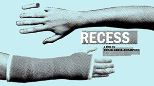
The Recess look book is a continual work in progress but, for now, I’ve done my best to challenge all the visual and audio details that I thought were nailed down while writing. And I’m having some fucking fun!
Happy 2015 everyone!
See a few look book examples here:
Evan Buxbaum’s feature, Sunbelt Express
Brett Haley’s feature, And Then I Go
Amber Sealy’s feature, New Mexican Rain
 Craig Abell-Champion: An unusual kid who grew up on a sheep farm in Oregon. When I reached legal adulthood I was gone and never looked back. I earned a BFA in photography and spent several years shooting pictures around the world. A cinema lover, I moved to Los Angeles in 1998. Directing TV commercials was my film school. Today, I have left the realm of thirty seconds for a longer narrative road. A first time writer/director, my project Recess is in the packaging phase seeking financing.


